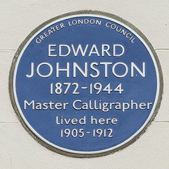
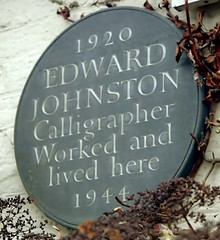
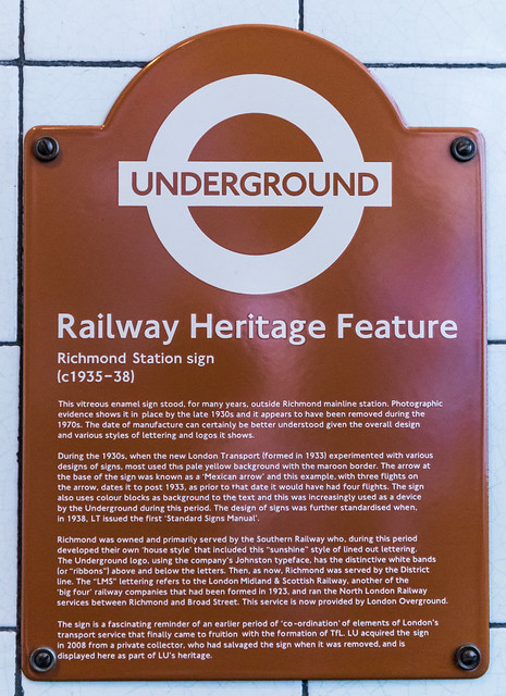
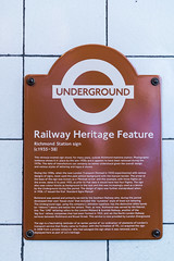
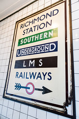
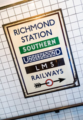
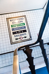
Railway Heritage Feature Richmond Station sign (c1935-38) This vitreous enamel sign stood, for many years, outside Richmond Richmond mainline station. Photographic evidence shows it in place by the late 1930s and it appears to have been removed during the 1970s. The date of manufacture can certainly be better understood given the overall design and various styles of lettering and logos it shows. During the 1930s, when the new London Transport (formed in 1933) experimented with various designs of signs, most used his pale yellow background with the maroon border. The arrow at the base of the sign was known as a ‘Mexican arrow’ and this example, with three flights on the arrow, dates it to post 1933, as prior to that date it would have had four flights. The sign also uses colour blocks as background to the text and this was increasingly used as a device by the Underground during this period. The design of some signs was further standardised when, in 1938, LT issued the first ‘Standard Signs Manual’. Richmond was owned and primarily served by the Southern Railway who, during this period developed their own ‘house style’ that included this “sunshine” style of lined out lettering. The underground logo, using the company’s Johnston typeface, has the distinctive white bands (or “ribbons”) above and below the letters. Then, as now, Richmond was served by the district line. The “LMS” lettering refers to the London Midland & Scottish Railway, another of the ‘big four’ railway companies that had been formed in 1923, and ran the North London Railway services between Richmond and Broad Street. This service is now provided by London Overground The sign is a fascinating reminder of an earlier period of ‘co-ordination’ of elements of London's transport service that finally came to fruition with the formation of TfL. LU acquired the sign in 2008 from a private collector, who had salvaged the sign when it was removed, and is displayed here as part of LU’s heritage.

55 Broadway, London
Google Streetview
OpenStreetMap